Designer Tips: How to Keep Shareholders Focused on Your Annual Report?

Does your company consistently publish an annual report, but it always feels like a copy-paste from previous years?


As a comprehensive document encapsulating a company’s journey over the past year, an annual report is intended for shareholders and other interested parties. It doesn’t just summarize the company’s gains and pains but also the obstacles and solutions undertaken. It is packed with essential content, from general information to reports from directors, operations, financials, and policies.


To present this comprehensive information effectively, an annual report must be written skillfully and beautifully, ensuring that key points are conveyed transparently to shareholders. However, is transparency alone enough to keep shareholders’ attention on your report?


Since there is no guarantee that a lengthy document will be read thoroughly to the end, which could mean that your company’s valuable insights and brilliant ideas remain trapped in an unappealing report.


But worry not! As designers who have worked on various projects, including corporate annual reports, we have a few tips you can apply when planning your company’s annual report.


1. Structuring the Report Flow with the “Dough Logic”


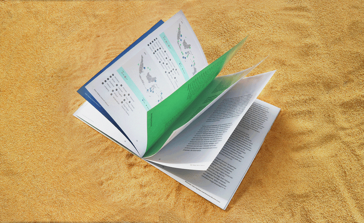
To create a more appealing report flow, you need to pay close attention to the structural organization of your report. We call this the “dough logic.” Just like dough that needs to rest after kneading to be processed optimally, a report should also allow its audience to take breaks from lengthy texts to avoid information fatigue.


A heavily text-laden report can be overwhelming for shareholders, making it just as important to provide breaks as it is to provide crucial information. Give them a visual pause with a refreshing design that is not necessarily complex or avant-garde. For instance, well-placed white space and color blocks can create a visually appealing rhythm.


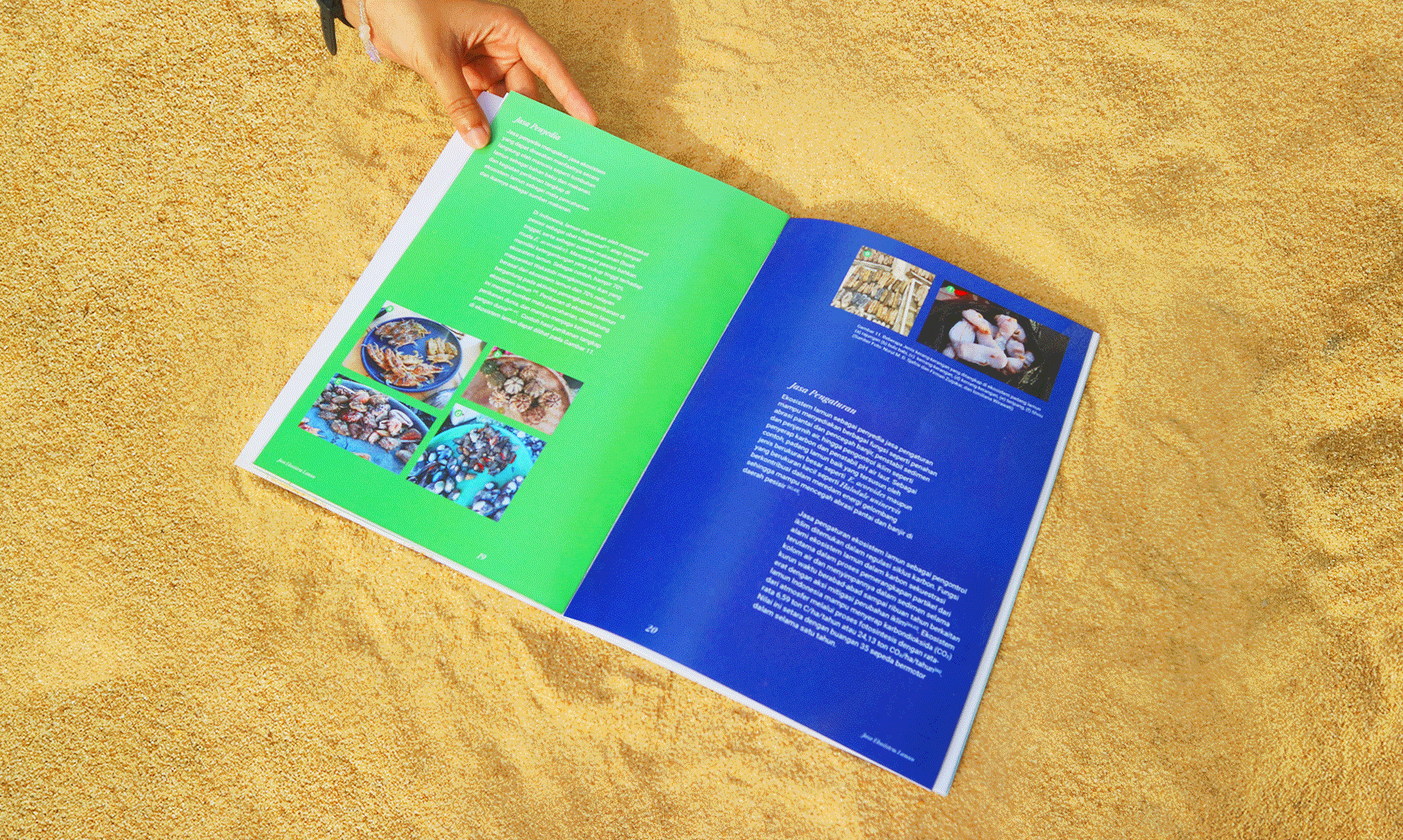
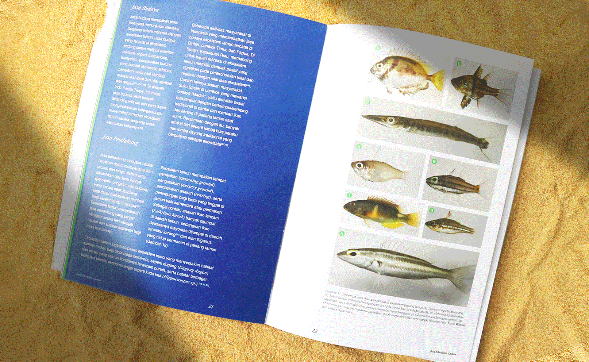
Take the annual report of Indonesia’s National Research and Innovation Agency (BRIN) as an example. It allows readers to take mental breaks from dense scientific information by using bold yet muted colors in between sections.


2. Playful Yet Professional Layouts


Who says professionalism has to be monotonous? When designing an annual report, you can incorporate playful elements while maintaining the report’s identity.


For example, in BRIN’s report, aside from color blocks, the fundamental layout is inspired by Swiss design principles—clean, structured, and professional. We enhanced its readability by not only relying on the same two repeated columns over and over again, instead we used white space and short narratives to add more variations, while supporting illustrations serve aesthetic purposes and create an emotional appeal for the audience.


So, not everything that follows a professional tone has to be rigidly formal. You can add a twist with elements of surprise to keep your audience engaged. After all, avoiding boredom should be a priority.


3. Readability and Legibility

Last but far from least, to sustain audience attention throughout the report, ask yourself: Is the font choice friendly enough for a long reading session?


A report that aims for decorative appeal, especially through font variations, can backfire if the composition and layout are not carefully considered. For example, blocky text meant to emphasize key points might reduce readability, making it difficult for the audience to grasp information at a glance.


Therefore, using serif fonts is a safe choice for formal documents as it always does. However, to add a fun yet professional touch, you might consider combining them with sans-serif fonts to serve a harmless twist while keeping the context and design balance in mind.


The points above might seem trivial compared to the overall content of the document. However, it’s essential to remember that the primary purpose of publishing the report in the first place is for it to be read thoroughly. Important information needs to be delivered with an effective hook to maintain audience attention and focus. Hence, seemingly small details is big enough to make an impact on your project.


You can create your own impact with us now. Tell us your needs, and we can start working on it together immediately.

Mixtape Illustration

Spotify: Fostering Emotional Bonds Through Human Orientation

Mixtape Illustration

Ever experienced the thrill of making a mixtape for your crush? Or for those who haven’t had the experience, maybe you watched it in a movie like “The Perks of Being a Wallflower”?

From the era of our parents, communication through music has been a common alternative because it has always been a way of expression and socialization, especially among couples. But as radios and cassette tapes became outdated, this behavior evolved from analog habits to digital media. Nowadays, radios are no longer in the picture, but we have plenty of digital music platforms that are even more convenient to use. Out of the many well-known names, Spotify always takes the number one spot in the digital music platform market. In this year alone Spotify holds a market share of 30.5% as seen through the 2023 report from the International Music Summit (IMS).


But what exactly makes Spotify always comes out on top?

Illustration of Spotify Sits on High Chair and Wears a Crown

When you hear the name Spotify, I bet you instantly think of a vast music collection, personalized music, and social activities. Am I right? If so, that’s what we’re going to talk about today.

For a brand as big as Spotify, which is said to have revolutionized the music industry, the first thing that needs to be done is establishing its brand identity, or branding. Branding is crucial as the foundation of a brand in the global market competition. Strengthening the roots through prepositioning and defining the target market should be done because this identity will define the direction in which our brand will move forward.

However, achieving this can be challenging if the brand does not understand user behavior. In branding, understanding human behavior is essential to create a brand that feels close and has an emotional connection with its users. Building an emotional connection between the brand and users aims to make people loyal to the brand and become brand ambassadors who promote the brand to others, even without any marketing endorsement efforts.

Now, Spotify understands that music is a means of expression and communication for many people. These two aspects have been the foundation of Spotify’s identity from the start and have been implemented through its features and marketing strategies.

As a means of expression, Spotify offers personalized music, so each account contains songs that match the user’s taste. This personalized system not only makes users feel understood but also provides recommendations for music they might not have known before but would probably enjoy. Spotify actively provides its users with the experience of “this is what you don’t know you need” through its recommendations.

Illustration of a man and a woman interact with each other and show Spotify

As a communication medium, Spotify thrives on its social activities that allow users to interact with each other. Users can engage “through” music, for example, using the Spotify Sessions feature. This feature enables users to listen to songs simultaneously even from a distance. There are also public playlist features that can be searched directly in the search bar, mutual following features where users can follow each other’s accounts and see their friends’ music activities, and the “Wrapped” feature that provides statistics on the music listened to throughout the year.


Fostering Emotional Connection

With the orientation on human aspect, human connection, and human emotions, Spotify plays with storylines to convey its message to users. Storytelling is the crucial effort in branding to build an emotional connection. For example, in its marketing campaigns, Spotify reminds users about the availability of public playlists that can be accessed anytime. Moreover, the messaging can be tailored to match the listener’s needs, such as recommending ballad playlists for comforting sadness, energetic playlists for workouts, and lo-fi playlists for study.

Illustration of a man screams, "Gua punya Spotify!"

As an impact of this connection is the often-seen expression on social media, like, “Maju lo nice try! Gue gak takut, gue punya Spotify!” As context, “nice try” is a term known on social media to express that one’s crush does not reciprocate their feelings. So, the expression means that even if users’ love interest rejected them, they can still turn to Spotify to be sad in their private space accompanied by music. This shows that through personalization, Spotify appears to understand and cater well to the user’s emotional preferences, and the users have the same impression of it.

To highlight this significance, Spotify is on point with its attempt in building emotional connection as we can observe at how its users perceive it in the manner it desires.

Other thing also can be seen in how users are reluctant to leave the musical “environment” that has been formed. This, in turn, makes them less likely to consider switching to other platforms.

Another notable aspect is the proliferation of third-party websites offering Spotify’s statistical algorithms that can be accessed anytime. Users can share their music preferences at any time. This is different from Spotify’s official Wrapped statistics which are only released once a year. Some examples of these websites include Receiptify, Judge My Music Taste, and others. Although it is not directly related to Spotify’s efforts, but it can also be identified as a way of communication and a form of social interaction that strongly aligns with Spotify’s values.

The last point to note is the importance of consistency. A strong identity and targeted storytelling are difficult to maintain without consistency. For at least a decade, Spotify has been leading the digital music platform market, and from the beginning until today, it has remained true to its core values.

Now, are you inspired by Spotify’s brand development? If you’re interested in building your own brand, our team at Orkha can definitely assist you with it!

Sources:
International Music Summit Business Report 2023
Why is Spotify The Outright Best Music Streaming App

thumb

Tumblr redesign: dot no more

Just last week, Tumblr announced their redesign of the logo and web. It’s the micro-blogging platform second overhaul to date, after the alteration of the wordmark in 2014.